You don’t need to redecorate your entire room to make a bold color shift—start with your sheets.
White bedding has long been a go-to for creating a modern, streamlined bedroom. But even the most versatile neutrals can start to feel a little flat.
To celebrate a brighter, more colorful season, Parachute is launching five new shades for their most popular linen sheets, pillow cases, and duvet covers. We spoke with chief creative officer Amy Hoban to learn more about the new palette and get some tips for choosing a bedding color scheme that feels fresh, cohesive, and easy to live with.
:strip_icc():format(webp)/linen-venice-set_marigold_lightbox_15762-1ca99e613f1941b983e35873491e4aa1.jpg)
Credit: Parachute
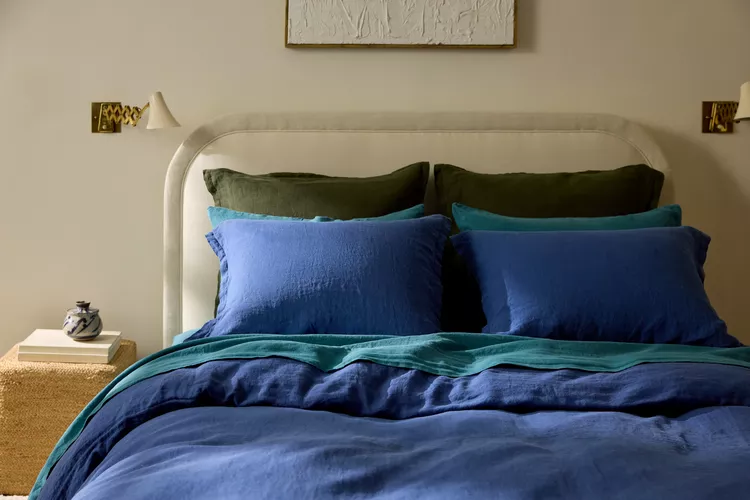
New Color Options at Parachute
This month, Parachute is expanding its linen bedding lineup with a bold new wave of color. The updated palette includes Cobalt, Marigold, and Peacock, which are rich, jewel-toned shades that make a statement. For a more grounded look, the brand is also introducing Tobacco and Honey, two earthy tones that are more vibrant than typical neutrals. These colors are a bold addition to Parachute’s existing color line that includes White, Fog, Bone, Toast, Moss, Dusk, Java, and Evergreen.
“We’re thrilled that color is back in style,” Hoban says. “As people trade in minimalist looks for bright colors and lively accents, we can embrace how color can transform a space, making it feel warm and inviting.”
Hoban says the five vibrant new linen shades are intentionally designed to coordinate with the existing palette. Each color should feel timeless and versatile, whether you choose warm or cool tones (or both). She hopes the collection can help customers create “bold monochromatic statements or seamless mixing and matching, both within the new collection and with our classic core palette.”
How to Choose a Bedding Color Scheme
Hoban thinks there are two main ways to incorporate more color into your bedding: go monochromatic or blend, with the former being more foolproof.
“One of the easiest ways to make an impact without worrying about ‘clashing’ is to embrace a full monochrome—go all in on a single color,” Hoban says. For more dimension, she suggests playing with texture and body, like layering a cloud-like linen duvet cover over a smoother sheet.
If one color everywhere seems too bold, mix one vibrant piece (like a top sheet) with a more muted base. Hoban says Bone or Cream pairs well with Honey, or a cooler light grey will blend well with Cobalt.
Blending Color with Existing Decor
It can feel intimidating to add color to a neutral room, but bedding is an ideal starting point. Hoban says to first consider the feeling of your space (or how you want it to feel). Is it bright and cheerful, or is it zen? Bright, energetic rooms will feel more alive with colors like Marigold or Cobalt. For an earthy, boho feel, pick Honey. Relaxing, spa-like spaces will pair well with Tobacco, which Hoban says is warm, deep, and sleepy.
“Once you’ve identified the feeling of the room, you can also consider if you’re more drawn to a cool or warm tone and how much contrast you’d like,” Hoban says. “Higher contrast beds (think white and Cobalt) will be an immediate focal point of the room, creating definition and energy. Lower contrast (think Bone and Honey) will be more understated and soft.”